Designing a design system inside an enterprise that already had one
Led a four-person team to refresh the Netsuite design system, ship a new component library and documentation site, and progressively earn adoption — starting with Analytics — without breaking the products that already depended on the old one.
Lead (effectively manager)
3–4 reports
Design system refresh · UI Catalog (DS website) · UI Library · Adoption
shipped
Context
Netsuite is a mature enterprise product with deep UI surface area and many independent product teams. A design system already existed. The work was to evolve it without breaking the organisations that depended on it: refresh the visual language, fix the documentation, build a usable component library, and earn adoption team-by-team.
That made the problem less about inventing a new set of components and more about changing how a large enterprise designed, documented, reviewed, and reused interface decisions. The objective was to get the system into the hands of roughly 50 self-serve product teams without forcing a risky big-bang migration.
Role & team
What I led
- A design sprint to discover the model people actually wanted, not the one we assumed they wanted.
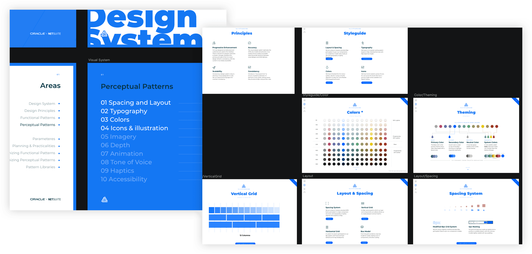
- A new Design System website, the UI Catalog, for components, patterns, and guidelines: the easiest place for designers and engineers to land.
- A visual refresh that teams could opt into incrementally, so the system could move forward without destabilising products already in market.
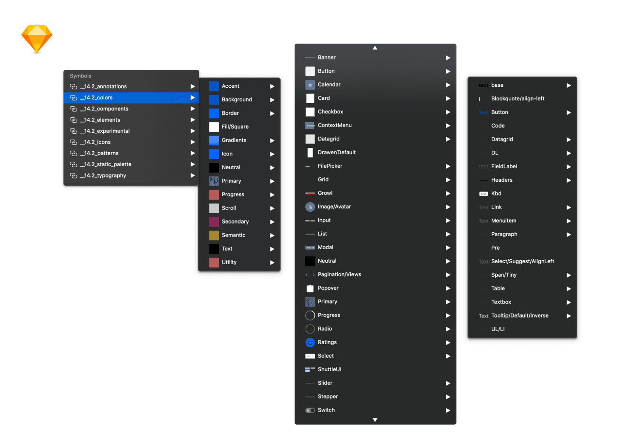
- A documented UI Library for designers, backed by pattern guidance and front-end framework alignment, so contribution and reuse became the path of least resistance.
Process — three acts
Act I — Sprint and re-pitch
I ran a five-day Google Design Sprint to land the model. The team moved through discovery, personas, ideation, definition, prototyping, and validation, then used the MVP prototype to re-pitch the design system as a product people could actually use.
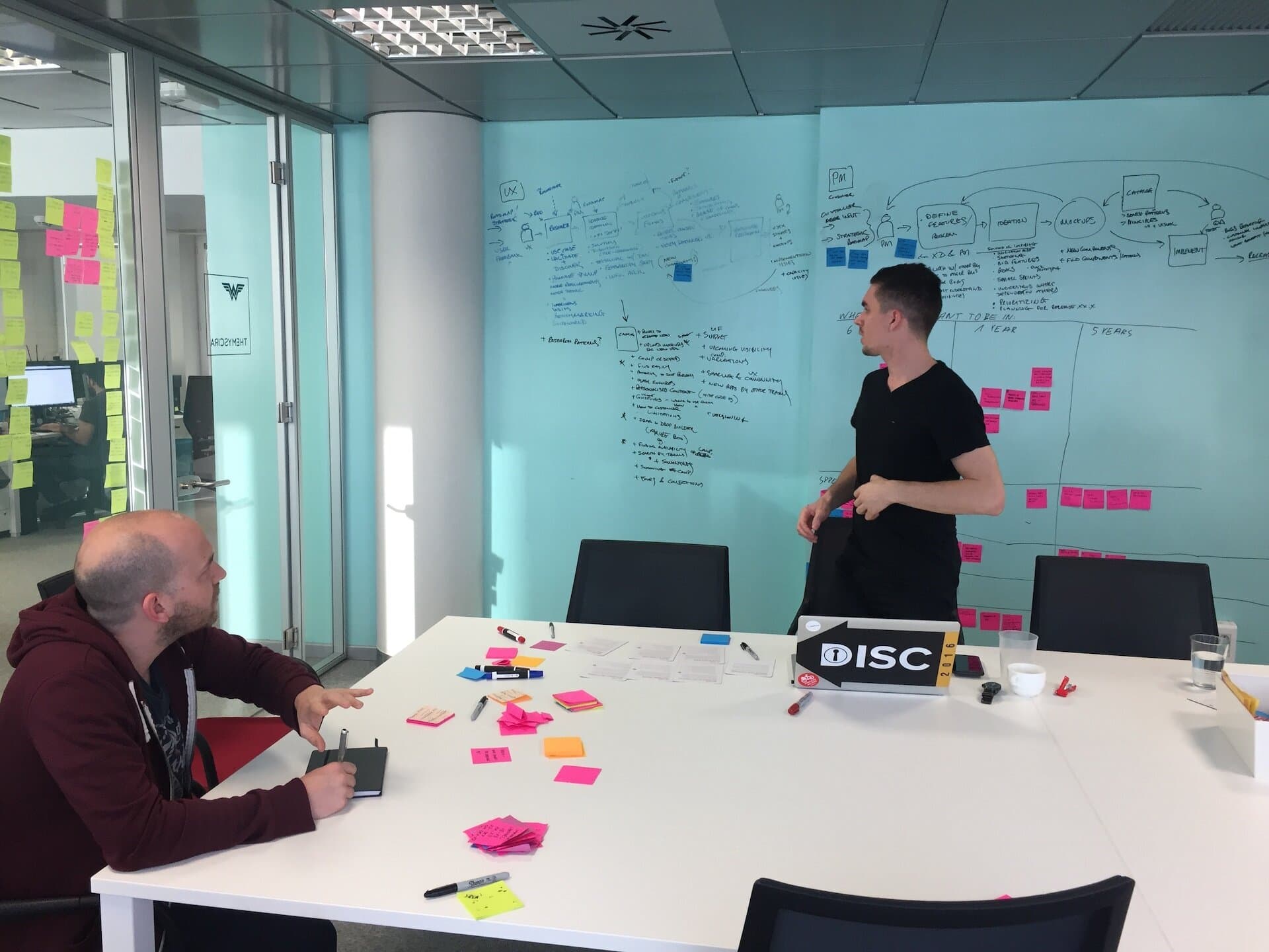

The output was a refreshed visual direction and a navigational model for the documentation site, reviewed with the wider XD organisation. The sprint also created a shared language for the people who would later have to maintain and adopt the system.
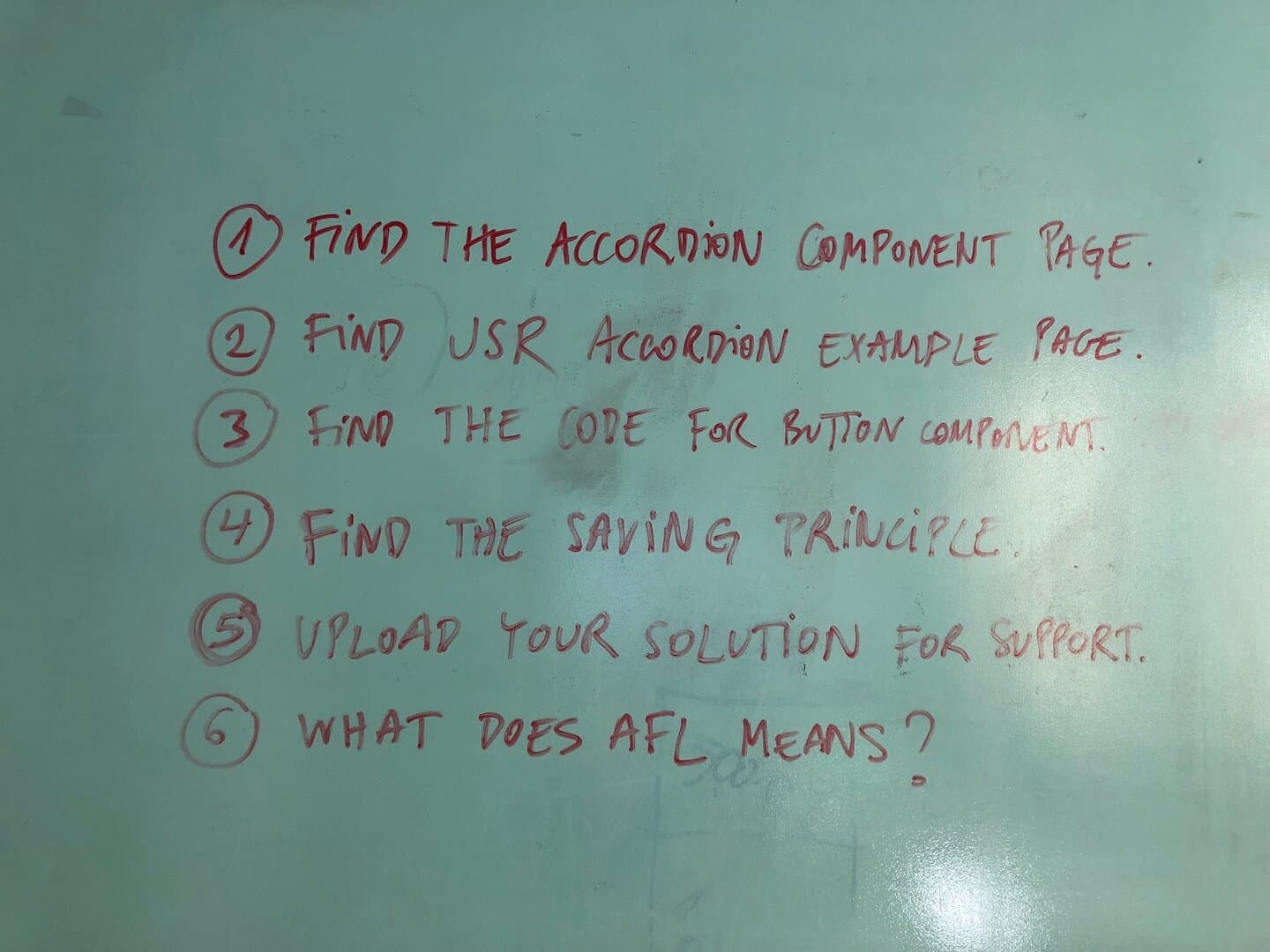
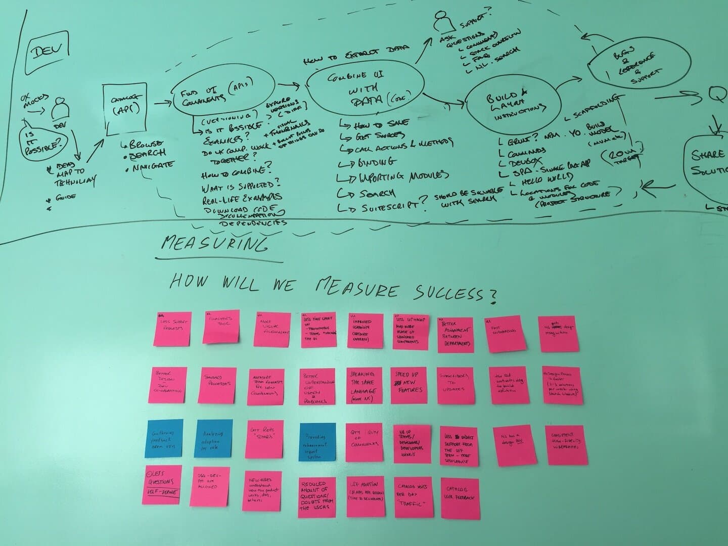
Act II — Build the catalog
I shipped the UI Catalog website and UI Library, wrote the documentation, and connected visual, code, styleguide, pattern, and component guidance into one delivery model. The work included repeated rounds with the UI Framework team so designers and developers were drawing from the same source rather than maintaining parallel truths.
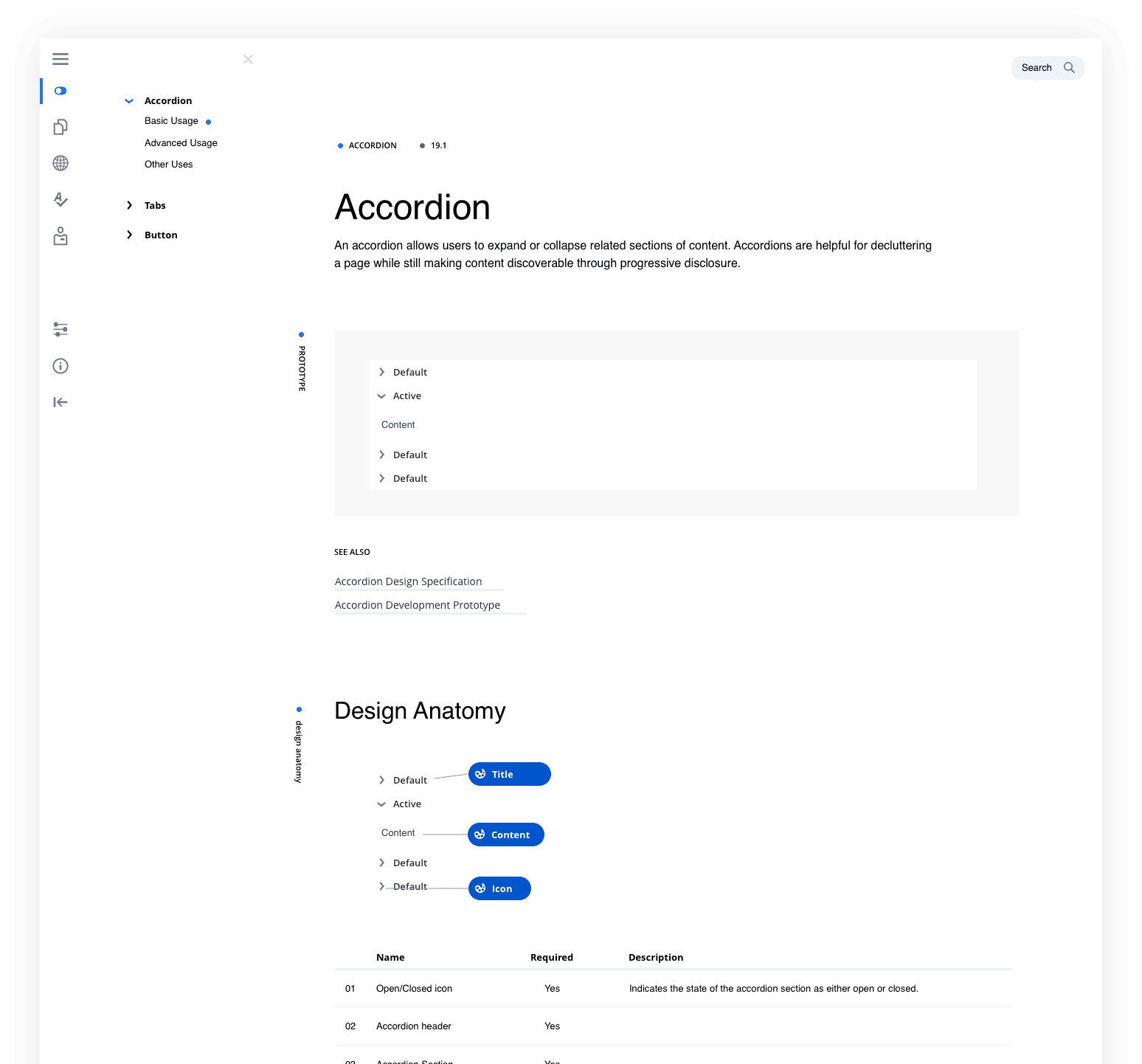
The catalog mattered because it made the system self-serve. Teams did not have to wait for a specialist to explain the latest pattern, theming direction, or component choice; they could land in one canonical place and move.
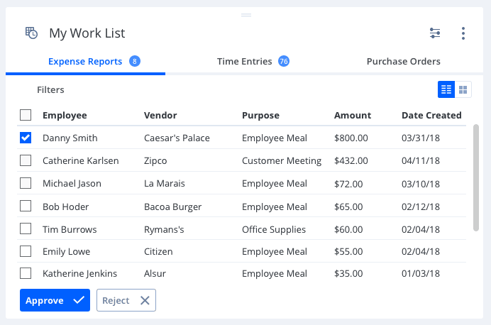
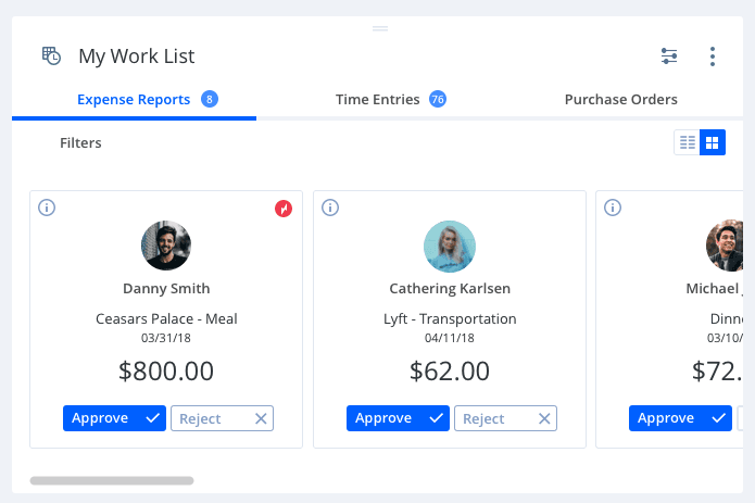
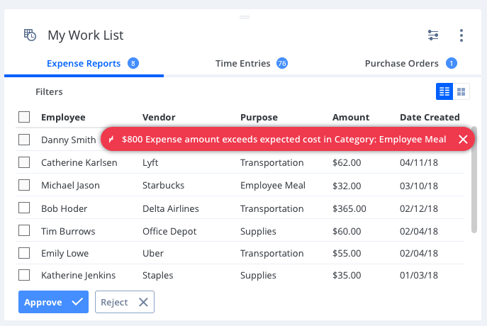
Act III — Win adoption team-by-team
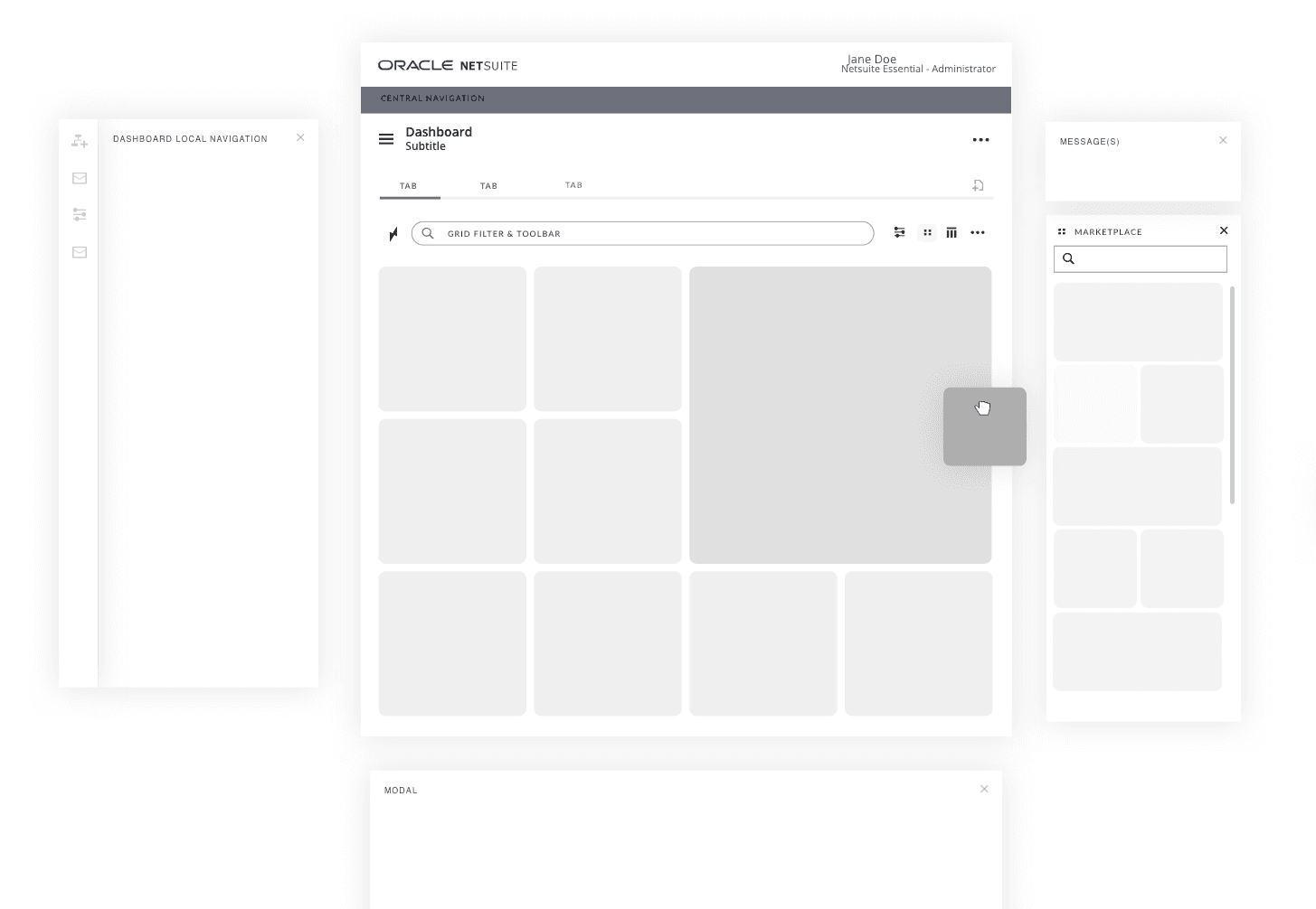
I started with the Analytics team as the lighthouse. Their adoption created a visible reference for other surfaces, including Merchandise Hierarchy and dashboard work. The adoption story became deliberately progressive: prove the refresh in one team, turn that into reference material, then use the reference to reduce risk for the next team.
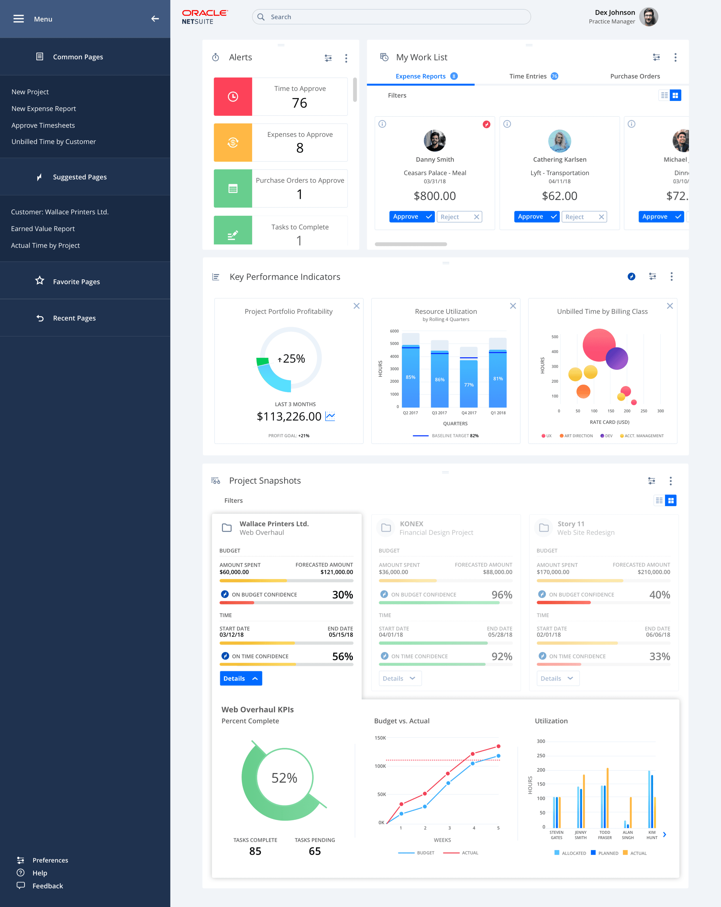
Act IV — Intelligence baked in
We treated the next step of the system as more than a visual refresh. The dashboards had to start carrying intelligence — leveraging the Netsuite data universe for comparative benchmarking, surfacing suggestions, and auto-approving the boring, detail-heavy, time-consuming work that consumed analysts' days.
Outcome
- Adoption: progressive uptake across product teams, starting with Analytics, then radiating into other product surfaces.
- Delivery: shipped the UI Catalog, UI Library, visual refresh, pattern guidance, and documentation model.
- Cross-functional reach: documentation became the canonical reference point, cited from Confluence and used by designers, PMs, content, and front-end partners.
- Leadership signal: the work generated cross-functional pull: designers came for pattern review, engineers for framework alignment, PMs for dashboard guidance, and leaders for the refresh direction.
- Future-facing work: dashboard concepts explored intelligence in the product experience and were demoed as an early concept at SuiteWorld 2018.
What I'd do differently
I would instrument adoption from day one. We had strong qualitative signal: the Analytics lighthouse, repeated praise for the refresh, designers and engineers routing questions through the catalog, and cross-functional quotes from PM, front-end, content, and XD leadership. What I would add now is a coverage dashboard: which teams had adopted which components, where divergence was happening, and where the system was saving delivery time. The story would have become easier to defend, fund, and scale.
“I think we should talk about your long term career goals, what you want to do, and what I have to do to keep you here long-term because I think you have Rockstar talents for sure.”