
Award-winning end-to-end consumer UX
Lead UX for an awarded consumer marketplace, end-to-end: research, IA, mobile + tablet + desktop responsive flows, wireframes and shipped product. Behance UI Award 2013 — early enough for the wireframing thinking itself to be the prize.
UX Lead
Research · IA · Wireframes · Responsive UI (mobile · tablet · desktop) · Search · Product detail · Checkout · Brand identity & packaging
shipped
Context
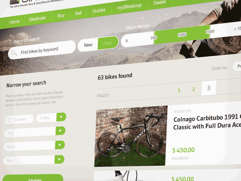
Bikesoup is a UK marketplace for cycle parts. Audience: enthusiast and professional riders. Conversion path: non-trivial — discovery, fit, comparison, checkout, all on a category that demands attention to detail.
Role & team
UX Lead for the marketplace experience. I owned the interaction model and wireframe system across the core discovery and conversion journey.
What I led
End-to-end product UX:
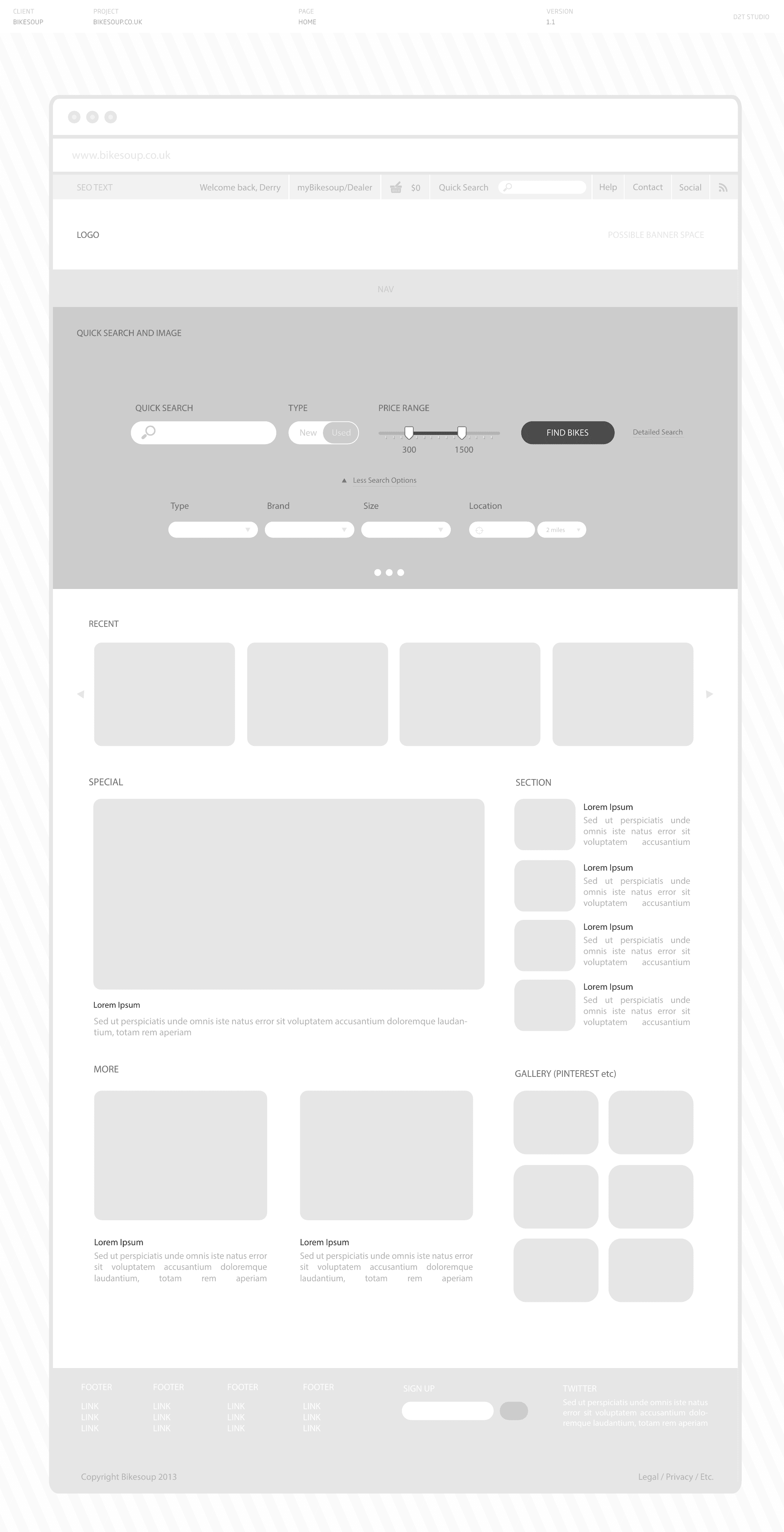
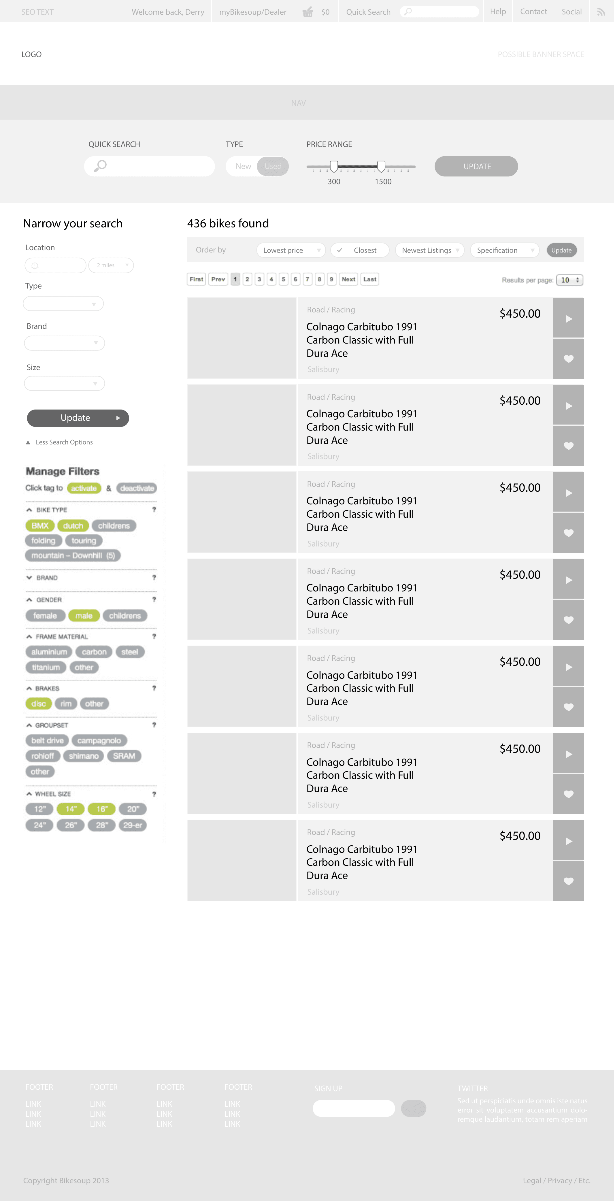
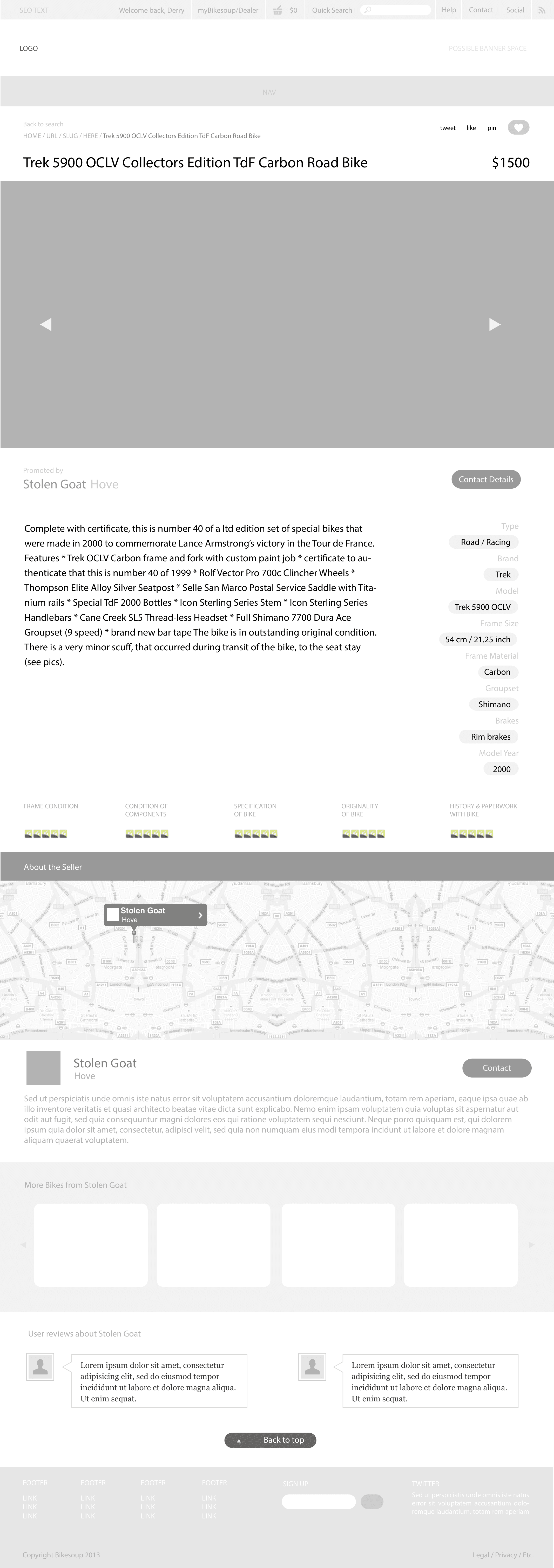
- Wireframes — three documented flows: search, results, product detail.
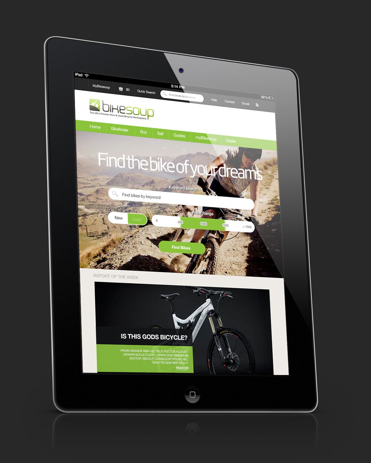
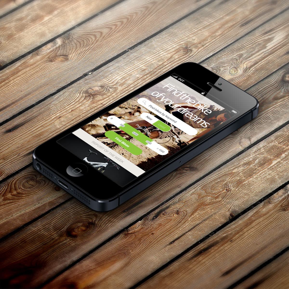
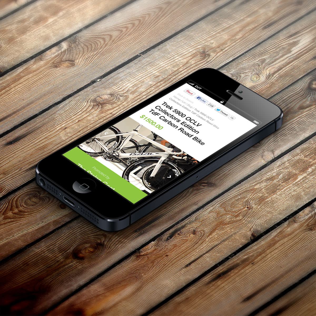
- Responsive design across mobile (multi-step flows), tablet, desktop.
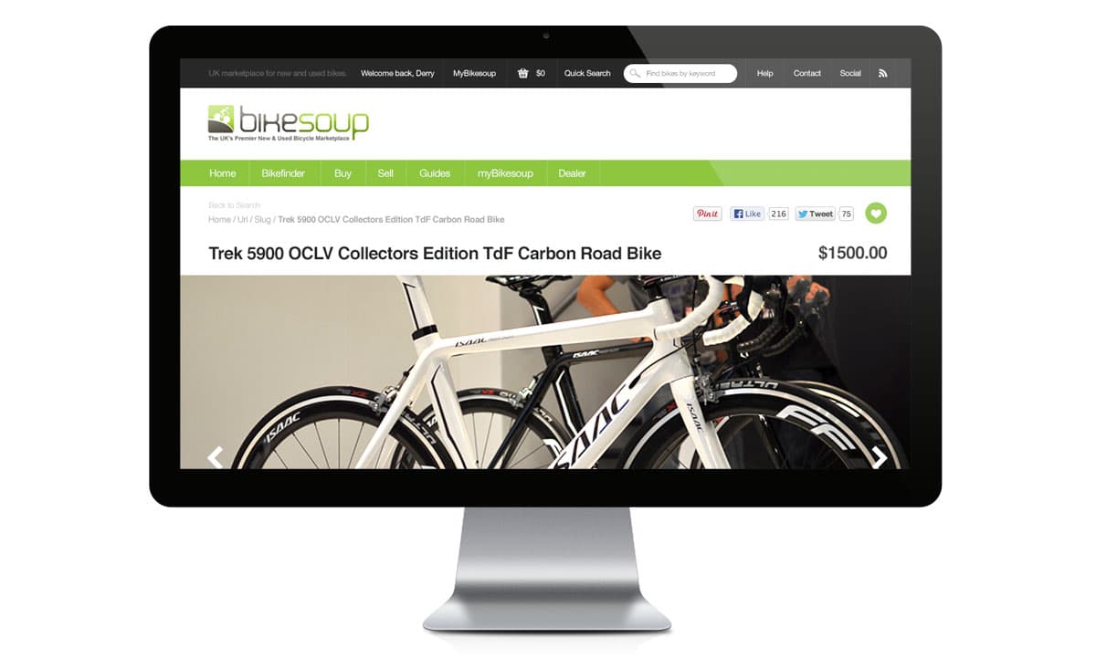
- Search + results + product detail flows — the conversion spine of the marketplace.
Process — three acts
Act I — Map the marketplace spine
I treated the marketplace as a sequence of decisions rather than a set of templates: find the right part, compare options, inspect fit and detail, then move toward checkout. That gave the work a clear spine before the UI had to carry visual polish.
Act II — Wireframe the critical paths
I documented the main flows as wireframes: search, results, and product detail. The aim was to make structure visible enough that product, design, and build decisions could happen against the same artefact.
What good wireframing looked like in 2013 — the artefacts that won the Behance UI Award, preserved as originals:
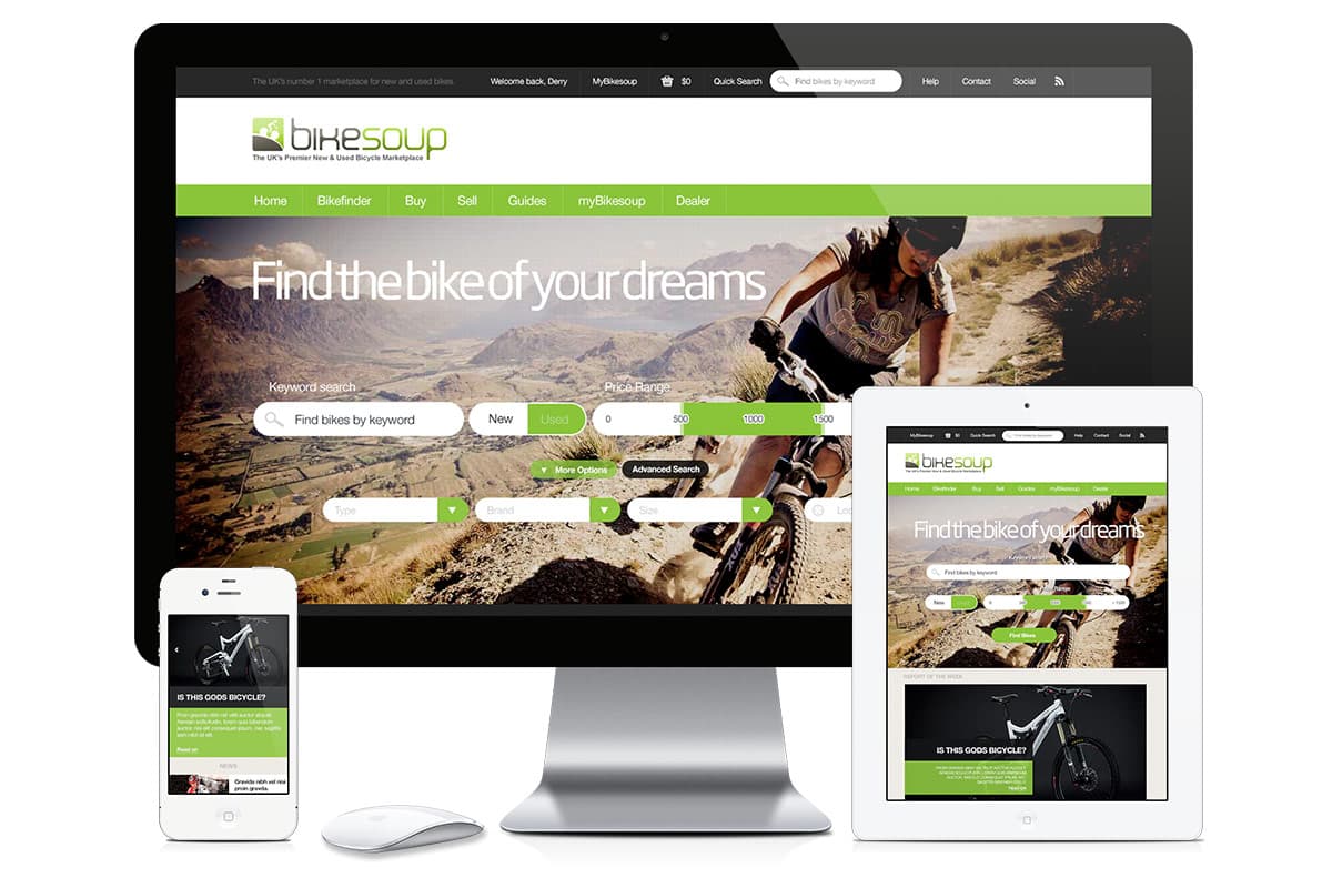
Act III — Make it responsive
The flow had to work across mobile, tablet, and desktop, with the same marketplace logic adapted to different levels of attention and screen space. The responsive set became the clearest evidence of the work because it showed the system thinking, not just individual screens.
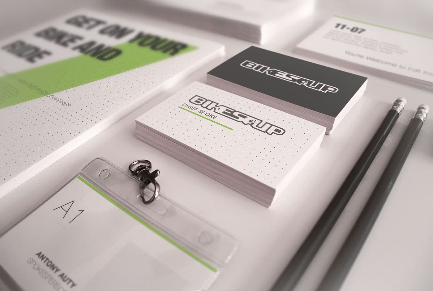
Act IV — Redraw the brand
The marketplace UX was only half the work. The brand identity — wordmark, packaging, stationery, applied marks — got the same end-to-end pass, so the product on the doorstep felt like the same studio that made the product on the screen.

Outcome
- Behance UI Award 2013 — for the wireframing thinking, early in the practice.
- Responsive UX coverage across mobile, tablet, and desktop for the marketplace conversion path.
- A published wireframe set strong enough to be recognised as UI/UX craft in its own right.
What I'd do differently
I would connect the wireframe system to clearer post-launch measurement. The work is strong as a craft and communication artefact, but I would now want the same clarity around search quality, comparison behaviour, product-detail confidence, and checkout progression.
Editor note. Lead the visual treatment with the responsive set (mobile + tablet + desktop side-by-side). The wireframe PDFs are good enough to show as artefacts — frame them as "what good wireframing looked like in 2013" rather than as legacy work.